Choking Hazard Poster
Personal Project
→ Print
→ Illustration
→ Typography
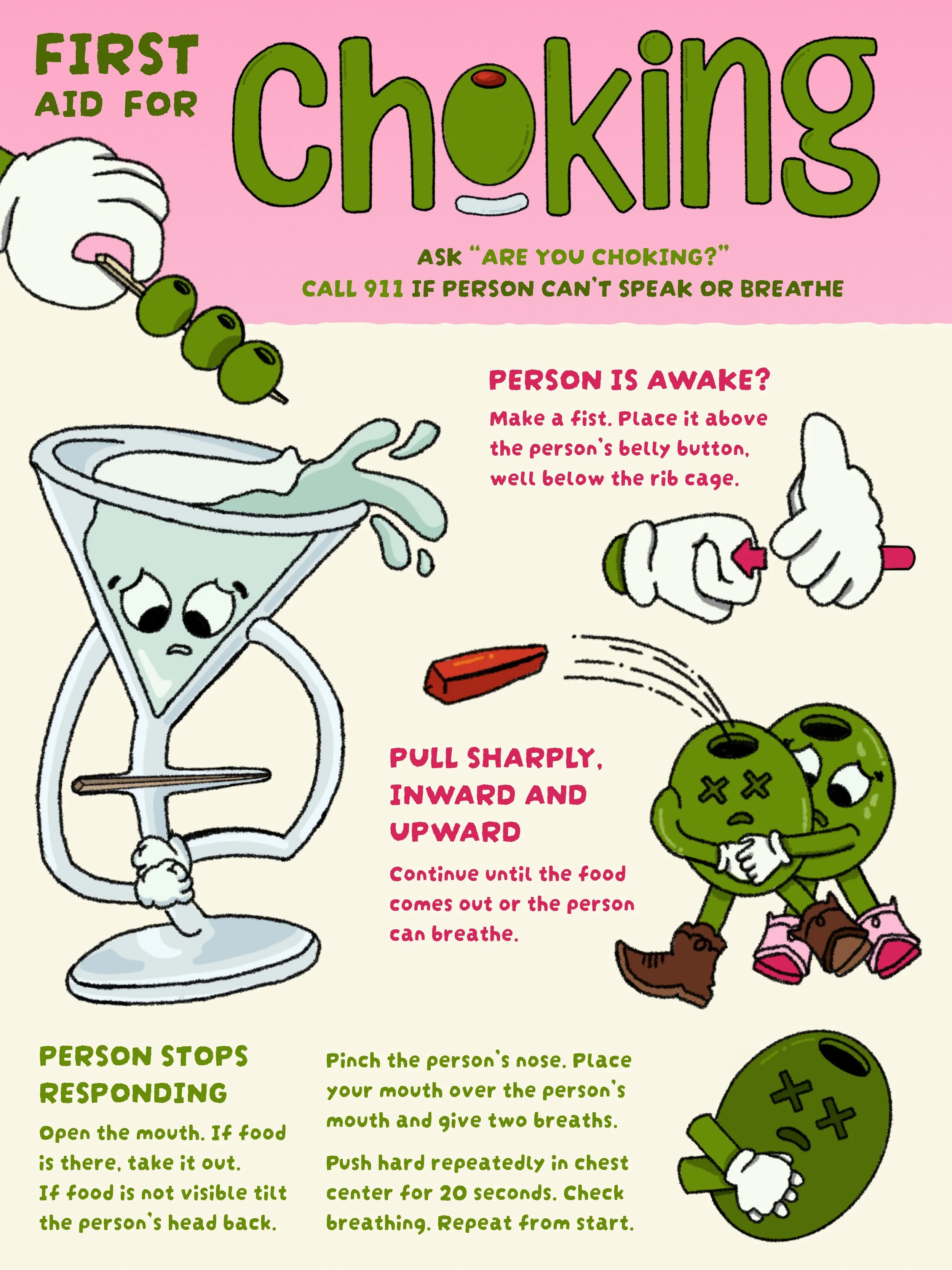
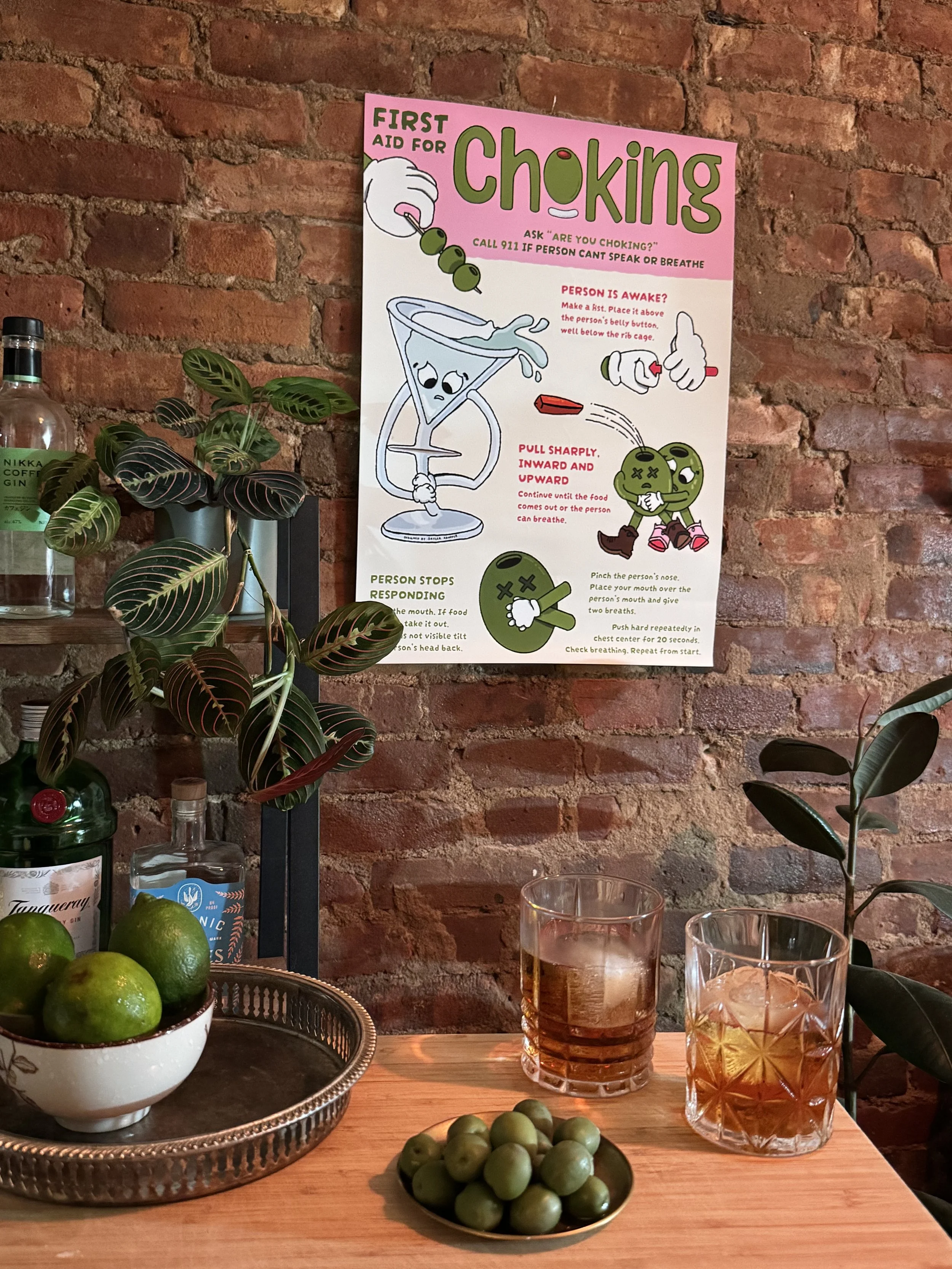
Choking hazard posters are a quintessential example of the creativity bursting out of NYC. With so many creatives buzzing around, even something as mundane and potentially overlooked gets attention, thought, and space to shine. Not only are these posters taking up valuable space in a city where every square inch of space is precious and expensive, but they can also easily be boring or off-brand. Designing these posters allows bars or restaurants to promote their unique voice while showing care for something small.
I started noticing these posters, among other regulatory signage, a few years ago, each one more creative or funny than the last, and I got obsessed with them. The regulations surrounding them are quite lenient, which allows for unique opportunities, both from the designer's perspective and the business's, turning what could be a design chore, like a PowerPoint, into something that provides genuine freedom.
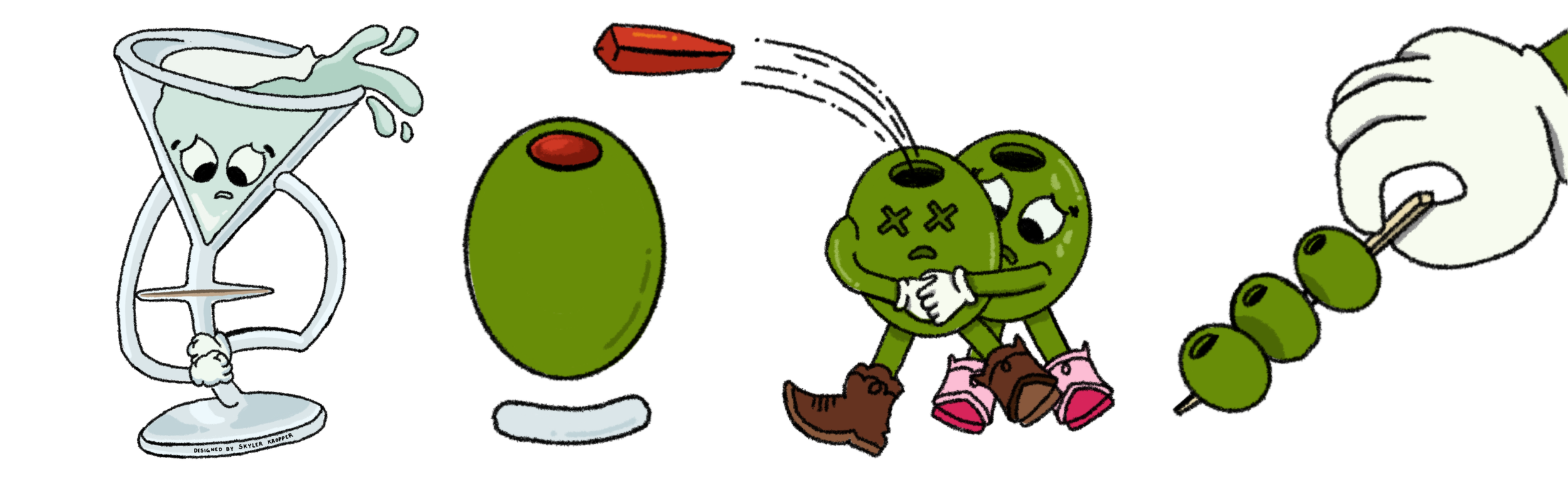
After researching these posters for about a year, I finally dove into creating one myself. Inspired by the 1930s cartoon style of Disney animation and the game Cuphead, I translated my ideas into a martini-themed poster fit for the quirky Brooklyn bars in my neighborhood. From the thin neck of a martini glass to the pimento-stuffed olives so trendy today, I designed the poster to be playful, and eye-catching. I love finding ways to make boring or complex information more fun and easy to digest — turning this required poster into something with real personality that puts a smile on people's faces.
You can learn more about my poster and design process on the Cultural Fingerprints podcast, where I talked with another required-sign lover and host, Rhea Kapur, about our obsession with all things NY design.