Creative Breakdown
Ahead of a Jackson Hole, Wyoming, rewards trip put on by the 360insights program, we sent out a fishing goods email to generate excitement for the trip, and to encourage related redemptions. Below is a breakdown of the sprint process.
Campaign: Rewards Marketing Campaign – Fall 2025
Purpose: Incentivize Fishing Product Redemptions in our Catalog
Audience: 360insight Clients - Ages 25-55
Send List: 12,000
Within a brand email, the sprint would include thorough brand research with a focus on digital footprint, design and copy tone, and popular products. A review would be completed by the brand and input would be incorporated into the final email. For examples of brand emails for Apple, Sony, and JBL, click here.
As this sprint focused on creating an email for a theme featuring multiple brands, it gave space for more creative freedom.
Problem to solve:
Limited Product Imagery: Image library was very limited – with few lifestyle images and low-quality product imagery.
Solution:
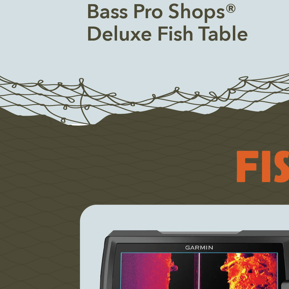
Product images were kept at smaller scales so no quality was lost. High-quality images were used as design elements and scaled up in size. Rather than using stock photos, I used licensed images from the products’s brand socials. This kept visuals stylistically consistent, creating a genuine feel. Design elements were central to this email to emphasize the fishing and wildlife feel.


Step 1: Sprint Planning
Define campaign purpose, target audience, key products, and timeline.
Step 2: Sketch & Research
Asset gathering of product photos and product descriptions was completed first, with a second round to pinpoint the hero image and stylistic imagery. I may edit the hero image, but all product imagery is always left untouched.
Design research & mood boarding:
Color palette picked based on imagery, 3-4 colors chosen.
3-4 typefaces are picked initially based on how they fit stylistically, with an emphasis on readability. Typefaces are narrowed down to 2 during design, one for headers and one for body copy. Typefaces chosen for this email were Belanosima, a vintage bold rounded font that’s playful and stands on its own for headers, and Avenir Next for the body copy, an ultra-readable classic typeface similar to Futura.
Design mood boarding inspired by Pinterest, Really Good Emails, and brand websites.
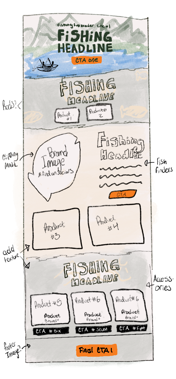
An email wireframe is drawn up.


Step 4: Deployment
Completed graphics are uploaded into HubSpot, our email CRM software, where I format the email and set up all backend data. I then conduct multiple rounds of testing with our marketing analyst to ensure ADA compliance and consistency across mobile and desktop views. Final testing includes ensuring all links and CTA’s are functioning properly.
Step 5: Performance Review
Following deployment, data is collected on email metrics such as open rates, click rates, and revenue produced.
Step 3: Design and Copy Alignment & Final Edits
Meeting with the copywriter to discuss what text is needed for the email and how it will be incorporated.
Final edits are completed.

As senior designer, I established a review process with our team, where monthly emails are assessed and analyzed to determine what succeeded and should be carried into future sends, and what could be enhanced. This process has led to improvements in team alignment and gives space to discuss emerging industry trends to include within our campaigns.